CSS布局-弹性盒子
参考:
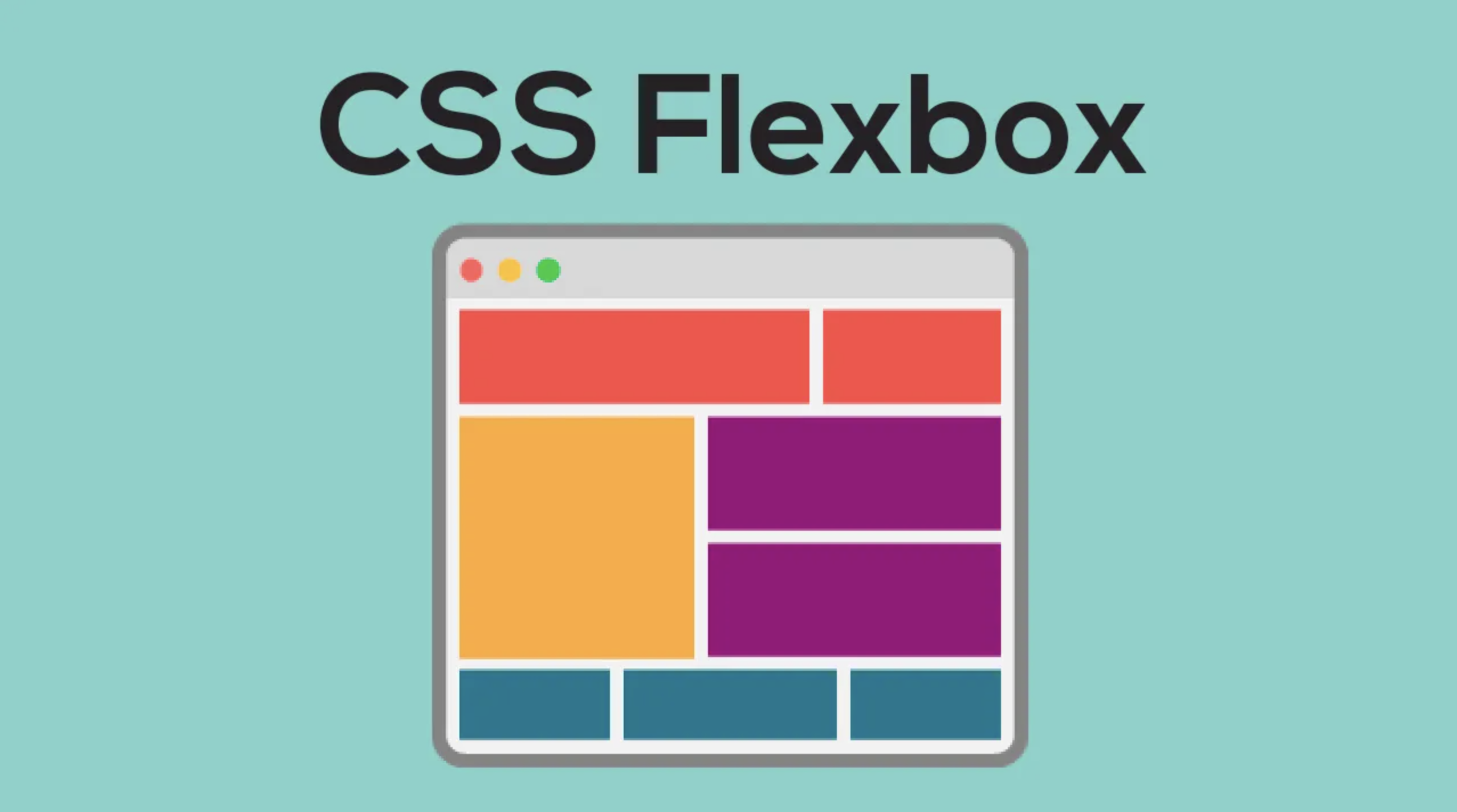
flex 是flexible box的缩写,意为弹性布局,用来为盒装模型提供最大的灵活性,任何一个容器都可以指定为flex布局。
1. 基本概念
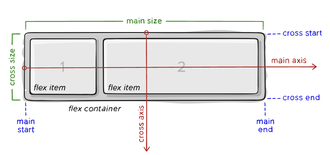
主轴(main axis):默认是水平轴,方向自左向右。
交叉轴(cross axis):默认是垂直轴,方向自上向下。
容器中的子元素叫做flex item,其占据的主轴空间叫做main size,占据的交叉轴空间叫做cross size。
2. 弹性容器属性
2.1 flex-direction
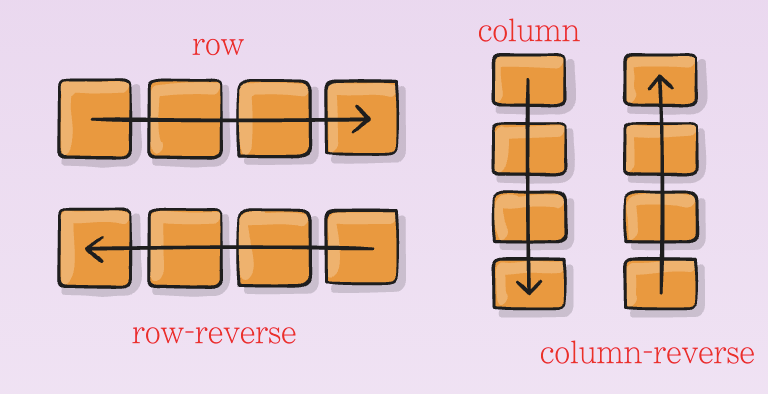
flex-direction决定了主轴的方向。一般不写也行,默认为水平方向,自左向右。
.box {
  flex-direction: row | row-reverse | column | column-reverse;
}
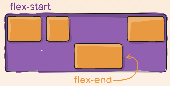
2.2 justify-content
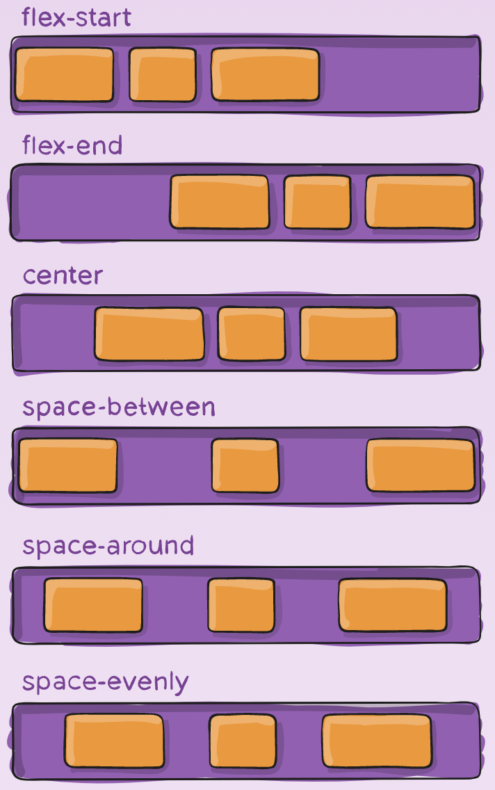
justify-content决定了flex item在main axis上的对齐方式,默认flex-start,与main start对齐。
.container {
  justify-content: flex-start | flex-end | center | space-between | space-around | space-evenly | start | end | left | right ... + safe | unsafe;
}
2.3 align-items
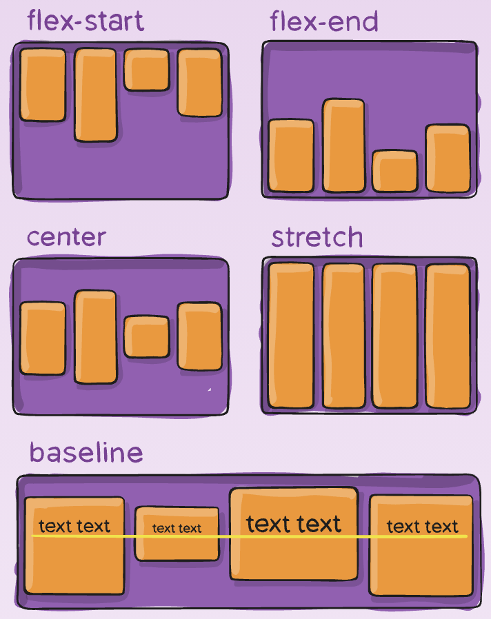
align-items决定flex items在cross axis上的对齐方式,
.container {
  align-items: stretch | flex-start | flex-end | center | baseline | first baseline | last baseline | start | end | self-start | self-end + ... safe | unsafe;
}
2.4 flex-wrap
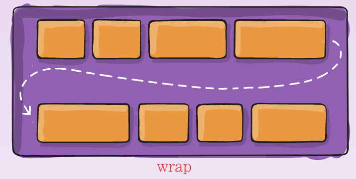
flex-wrap决定了flex container 是单行还是多行。默认nowrap是在一行上,不换行。
nowrap:所有flex items在一行
wrap:所有flex items在多行,方向从上到下
wrap-reverse:所有flex items在多行,方向从下到上
.container {
  flex-wrap: nowrap | wrap | wrap-reverse;
}
2.5 align-content
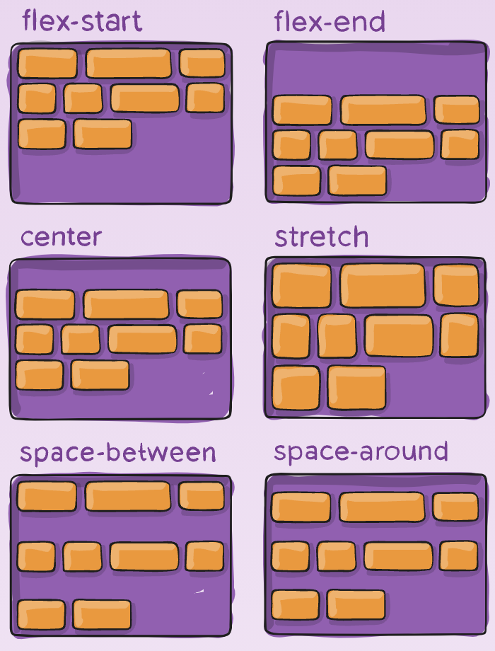
align-content决定了多行flex items在cross axis的对齐方式,用法与justify-content相似,一个是横轴,一个控制竖轴。
.container {
  align-content: flex-start | flex-end | center | space-between | space-around | space-evenly | stretch | start | end | baseline | first baseline | last baseline + ... safe | unsafe;
}
2.6 flew-flow
flew-flow是flex-direction与flex-wrap的简写。
.container {
  flex-flow: column wrap;
}
3. 子元素(flex item)属性
注意⚠️:float, clear and vertical-align对flex item无效。
3.1 order
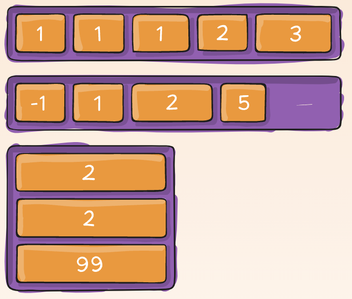
order决定flex items的排布顺序 (用的不多),可以设置为任意整数(正整数、负整数、0),值越小越排在前面。
.item {
  order: 5; /* default is 0 */
}
3.2 align-self
align-self相当于继承父元素的align-items属性,如果没有父元素,则等同于stretch。
.item {
  align-self: auto | flex-start | flex-end | center | baseline | stretch;
}
3.3 flex-grow
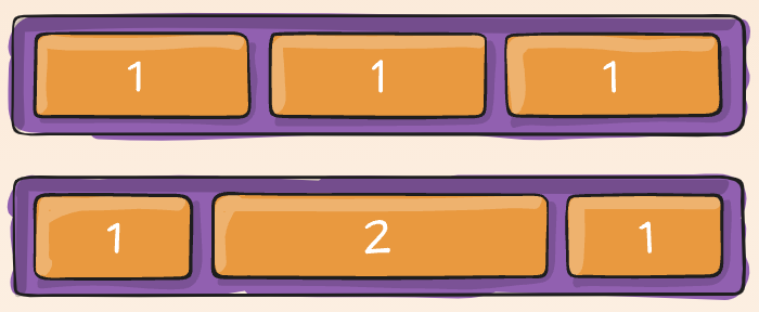
flex-grow属性定义项目的放大比例,默认为0,即如果存在剩余空间,也不放大。
.item {
  flex-grow: 4; /* default 0 */
}
Negative numbers are invalid.
3.4 flex-shrink
flex-shrink (shrink收缩)与flex-grow相似,一个扩展,一个伸缩
.item {
  flex-shrink: 3; /* default 1 */
}
Negative numbers are invalid.
3.5 flex-basis
flex-basis用来设置flex items 在 main axis方向上的base size。默认为auto,可以设置具体的宽度数值。flex-basis属性定义了在分配多余空间之前,项目占据的主轴空间(main size)。浏览器根据这个属性,计算主轴是否有多余空间。它的默认值为auto,即项目(item)的本来大小。也可以设置跟width,height一样的宽高,表示item将占据固定的空间!
.item {
  flex-basis:  | auto; /* default auto */
}
3.6 flex
flex 是flex-grow || flex-shink || flex-basis的简写。可以指定1 2 3个值 依次按照上述顺序!默认值为 0 1 auto。
.item {
  flex: none | [ <'flex-grow'> <'flex-shrink'>? || <'flex-basis'> ]
}